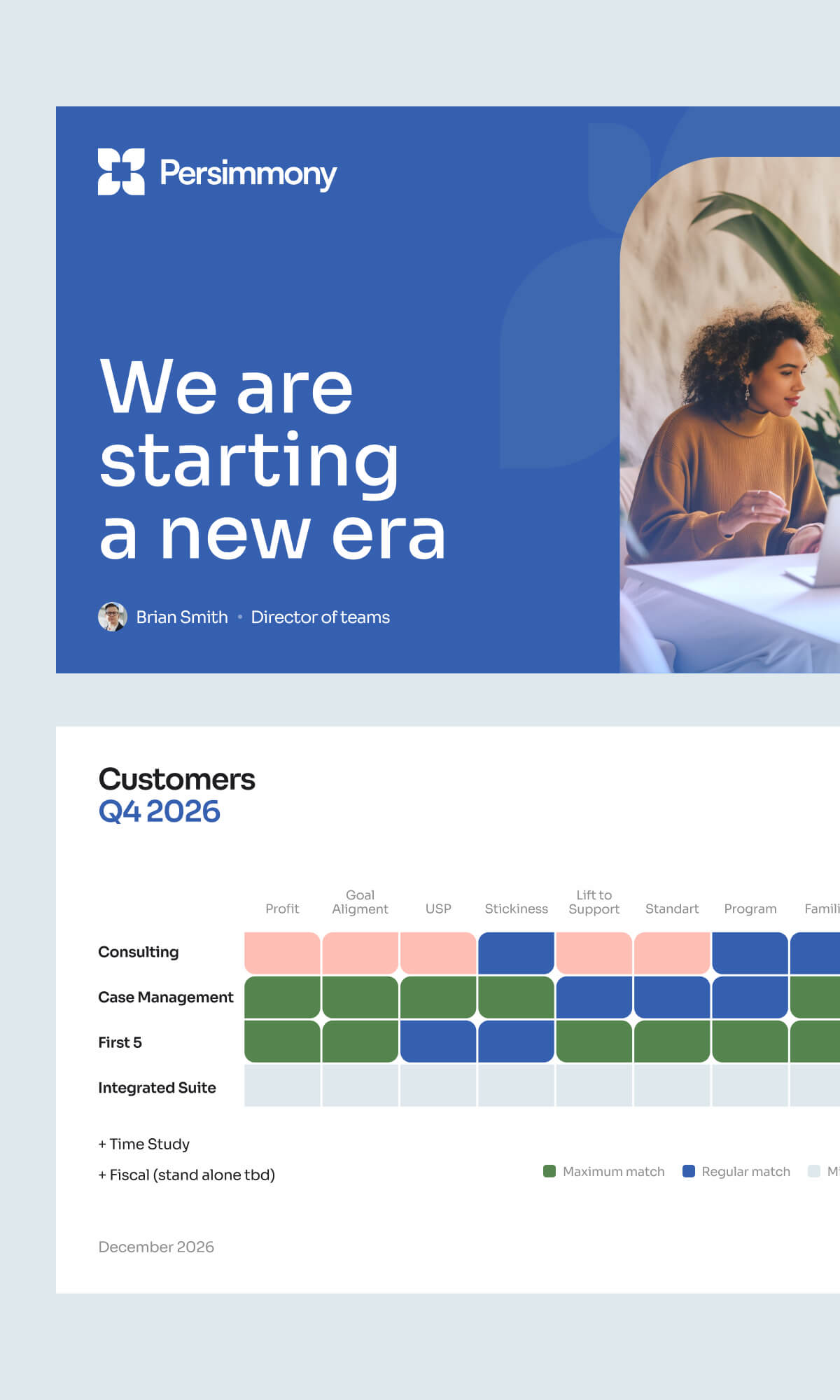
— a Texas-based SaaS platform established in 2002 by a practicing physician. It assists governmental and commercial organizations in collecting, analyzing, and managing data in public health, early childhood development, and social support.
Linkedin
James Greaves
Persimmony, CEO
Persimmony, CEO
Bounce Rate
–26%
Conversion rate to leads
+400%
Vi
Vi
s
it
lwebsi
te
Vi
s
it
lweb
si
te
Visit website


A founder builds for twenty years. A rebrand distills what matters.
branding
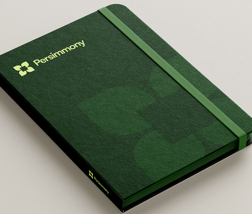
Every element earns its place. The persimmon garden sets the tone — care, harmony, naturalness. Everything deliberate. Nothing decorative.
The flower mark breaks into four parts: the product's core logic, made visual. Different users, one platform — modularity you can see.
The square at the center holds two meanings — pixel and secure storage. Digital precision and trust, in a single form.
The flower mark breaks into four parts: the product's core logic, made visual. Different users, one platform — modularity you can see.
The square at the center holds two meanings — pixel and secure storage. Digital precision and trust, in a single form.
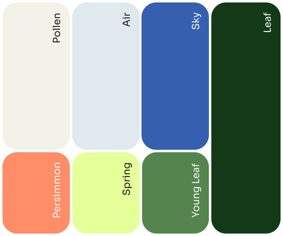

Sora — "sky" in Japanese. The typeface adds air and openness to the visual language.
Persimmony is a dense word — tall letters, tricky to read at speed. We prioritized legibility from the start: the logo works equally well on screen, in print, and inside the interface.
Persimmony is a dense word — tall letters, tricky to read at speed. We prioritized legibility from the start: the logo works equally well on screen, in print, and inside the interface.
.avif)
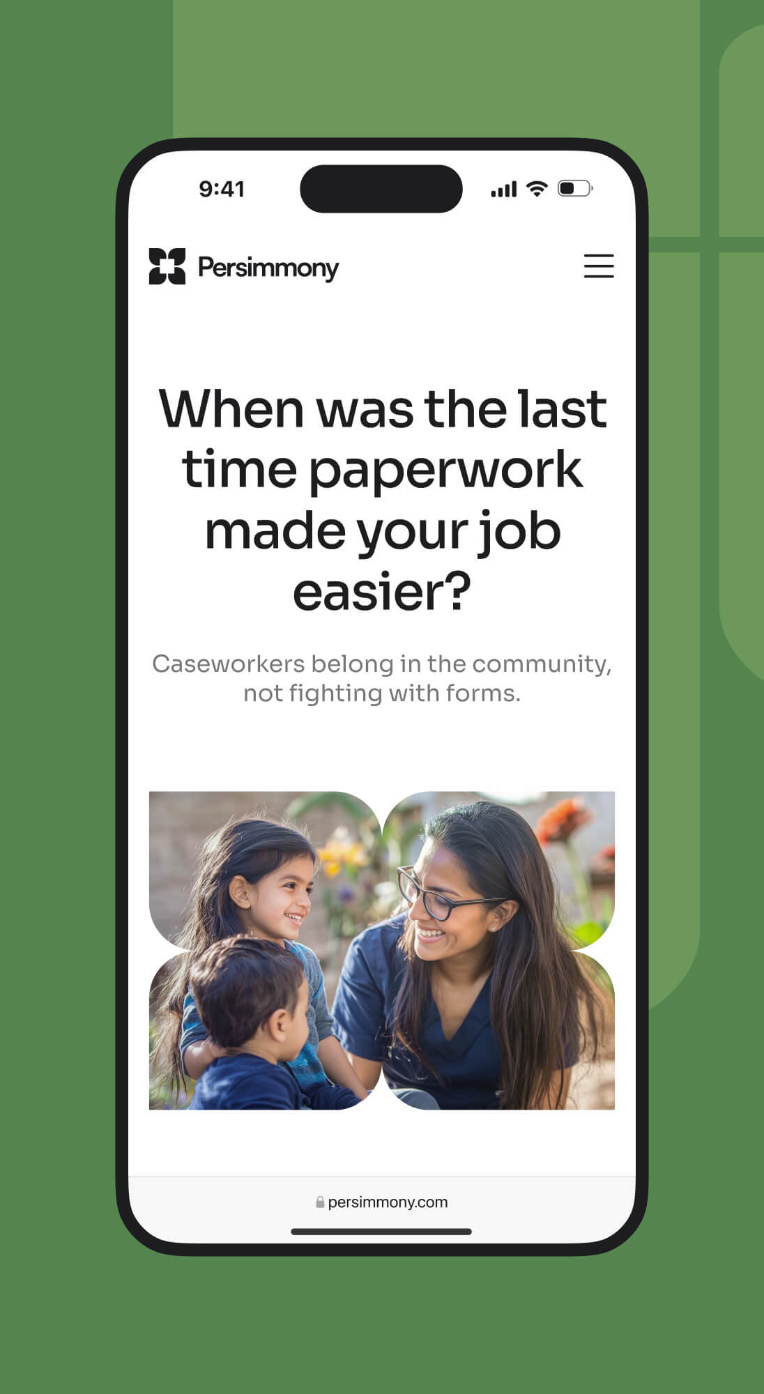
We designed the website to ensure the user journey is straightforward and intuitive.
website
The audience for Persimmony primarily consists of educated professionals over 50, who are busy but lack extensive digital experience. For them, it's crucial to present information simply and minimize actions:
Every design decision followed:
- Light, purposeful animations that guide, not distract
- Simple navigation through scrolling and reading
- Large headings and fonts for easy scanning
- Clear illustrations and icons to support content
Currently, the Persimmony product is undergoing a complete rethinking. To bridge the gap between the old interface and the new identity, we proposed a temporary and cost-effective solution.
product
In this web app update, we refreshed only:
- Fonts
- Color palette
- Panels
- Shapes and icons

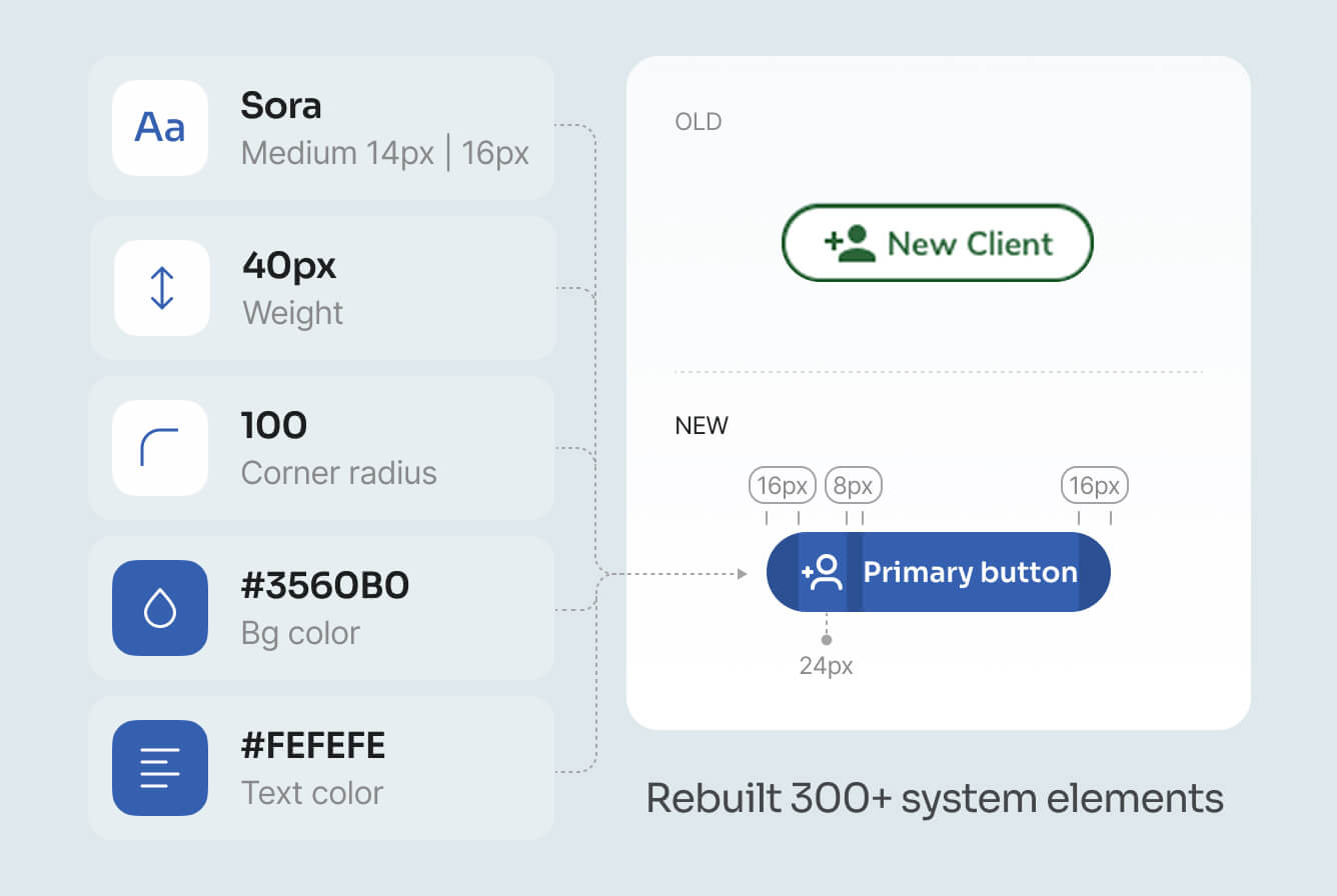
The identity now matches the product — and the market noticed.
results
Rebranding and redesign have restored Persimmony's visual relevance and strengthened its market position. The next step is a fundamental update of the web application.
Bounce Rate
–26%
Average time on site
+40%
The number of targeted actions on key pages increased.
"We never felt like we were being managed by an external agency; it felt like collaborating with a team of co-authors who were just as invested in the outcome as we were."
.png)
Linkedin
James Greaves
Persimmony, CEO
Persimmony, CEO
Next case study
